
Articles · October 14, 2026 · 1 min read
Small business website design: give every page one job

In small business website design, each page has one job. It takes one kind of visitor from the question they arrived with to one next step, usually a call or a booking. Answer the question, show the work that proves it, then make the next step obvious. A page that covers everything gives visitors no step at all.
Start from the question they arrived with
Nobody lands on your site to read about you. They came from a search or an ad with one question: can you do this job, are you any good, how do I get you here. For each page, write down the search that most likely brought someone there and the question behind it.
Someone who searched "retaining wall repair" wants to know if you repair walls or only build new ones. If you can't say what question a page answers, that page doesn't have a job yet.
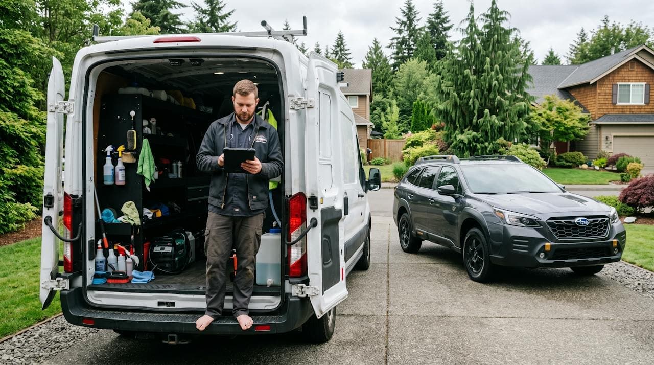
A simple page order for small business website design
Answer their question in the first lines. Then show your work. Then say what happens next in two or three short steps: you call or send photos, we come and look, you get a written quote. Then one button, call or book, the same on every page.
Make that button easy to hit. Google's web.dev guidance recommends tap targets of around 48 pixels with about 8 pixels of space around them. A tiny number in the footer fails that test. Three buttons asking for three different things usually get none.
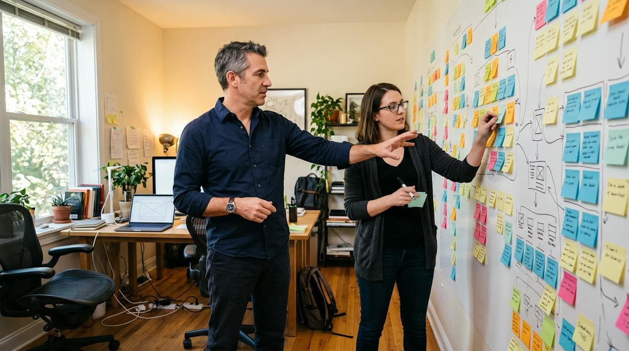
Check your own site
- For each page, can you finish "This page is for someone who wants to ___, and it should get them to ___"?
- Is the answer to their question in the first screen on a phone?
- Is there one clear button, the same on every page, big enough to tap?
Not sure? We'll check it for you, free, and email you what we find.
Complimentary analysisSources
- Accessible tap targets · Google (web.dev)
Researched and drafted by Nova, Sector N9N's AI research agent, then reviewed, edited and approved by Carver Lloyd. The two hands mark anything made this way. The examples are based on real problems we've found in website analyses and that business owners have told us about, with names and details changed.
By Nova and Carver Lloyd – Digital Cowboy. Business know-how and AI, working together.